Four shape functions and what each one is for
clip-path removes everything outside a shape you define. What is left is not merely hidden: the
clipped area stops rendering and stops receiving pointer events, so a link clipped to a circle
genuinely cannot be clicked outside that circle. That is the real difference between it and
overflow: hidden.
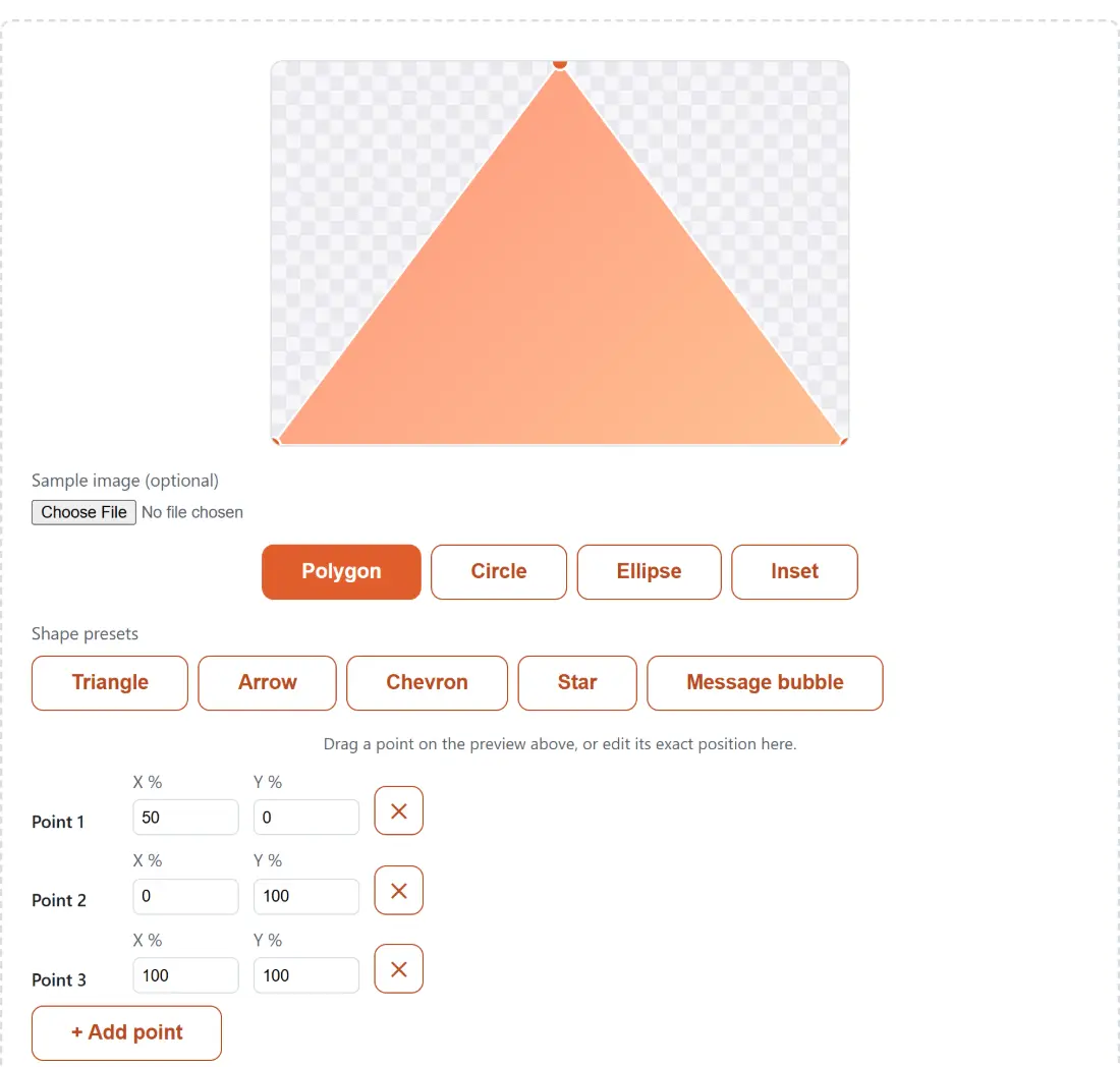
Four buttons under the preview switch between the four shape functions it writes:
- Polygon is a list of (x%, y%) points joined by straight edges. Triangles, arrows, chevrons, ribbons, stars and any custom silhouette are all polygons with different point counts.
- Circle clips to a circle with one radius and a centre position.
- Ellipse clips to an oval with independent horizontal and vertical radii, useful when the shape has to follow a wide banner or a tall card.
- Inset clips to a rectangle pulled in from each of the four edges, with optional corner rounding. It is the mode for a plain cropped or framed look, and the only one with no draggable handle: you type the four edge values.
Dragging a handle beats picturing a percentage grid
Hand-writing polygon(50% 0%, 0% 100%, 100% 100%) means holding a percentage grid in your head and
running an edit-save-refresh loop until it looks right. This builder inverts that.
- Pick a mode: Polygon, Circle, Ellipse or Inset.
- In Polygon mode, drag a handle on the preview, or start from one of the Shape presets buttons.
- Type exact figures into the X % and Y % fields under the preview when a drag is not precise enough.
- Click Copy CSS to take the declaration out of the box.
Circle and Ellipse each expose one draggable handle, their centre; their radii are typed. Polygon exposes a handle per point, plus + Add point, which drops the new point ten percent right of the last one so repeated clicks fan out instead of stacking, and a remove button per row that disables itself once three points are left, since a polygon needs three to enclose an area.
The output box holds a complete declaration, clip-path: ...;, rather than a bare value or a whole
rule, so it drops straight into an existing selector.
Where the preset coordinates come from
Five presets sit under Shape presets in Polygon mode. Triangle is the simplest three-point shape
there is: top centre, bottom left, bottom right. Arrow, Chevron and Message bubble were checked
against published clip-path coordinate examples rather than written from memory, which matters
because a chevron whose notch is a few percent off looks subtly wrong.
Star is the interesting one. It is generated rather than typed: ten vertices alternating between an outer and an inner radius every 36 degrees, starting straight up. The inner radius is the outer radius divided by the golden ratio squared, roughly 38.2 percent of it, which is the exact proportion of a real pentagram rather than an eyeballed approximation. One consequence you can check by looking at the point list: the top spike lands at exactly 50 percent across and 0 percent down, dead centre on the top edge. Every preset is a starting point rather than a lock: load one, then drag its points.
The clamps: radius to 150 percent, inset edges to 50
Polygon point coordinates and the circle and ellipse centres clamp to 0 to 100 percent, which is the box itself. Radii clamp to 0 to 150, deliberately allowed past 100 so a circle can extend beyond a corner of its element, which is what you want for a reveal animation originating off-shape. Inset edges and the corner rounding clamp to 0 to 50, because two opposite insets past 50 percent would already have clipped the element away to nothing. Every value that reaches the CSS is rounded to two decimal places, so a drag never produces a fourteen-digit float in your stylesheet.
Percentages resolve against the element you apply the declaration to, not against this preview. The
preview box is a 3 by 2 rectangle, so the same polygon() on a square avatar reshapes to those
proportions. If a shape has to hold its angles whatever it is applied to, pixel values are the unit
you want.
Checking the crop against a real photo
A flat colour block tells you the outline. It does not tell you whether the crop takes someone’s chin off. The Sample image (optional) picker swaps the placeholder for one of your own images, which is the check that actually matters for a hero image, an avatar or a product thumbnail.
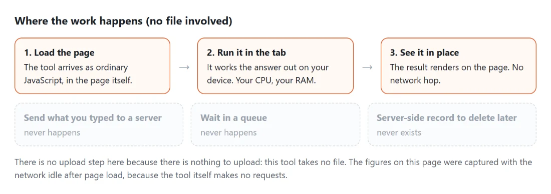
The file is turned into a local blob: URL and handed to the browser to display. This tool never
reads its bytes, never re-encodes it and never transmits it, so there is no size limit here at all;
the picker simply asks your operating system for image files. Remove image puts the placeholder back.
Nothing here is saved, so copy before you leave
There is no account, no server and no local storage behind this builder. The shape lives in the tab’s memory for as long as the tab is open; refresh or close it and you are back at the starting triangle with the default circle, ellipse and inset values. Take the declaration out with Copy CSS, which shows a manual-copy message if the browser refuses the clipboard, before you navigate away.
The neighbouring CSS builders tend to be the next stop: the CSS Gradient Generator for the fill behind the shape, the CSS Box Shadow Generator for depth, and the CSS Grid Generator for the layout around it. The rest sit on the generators hub.