Linear, radial and conic, and the one control each type exposes
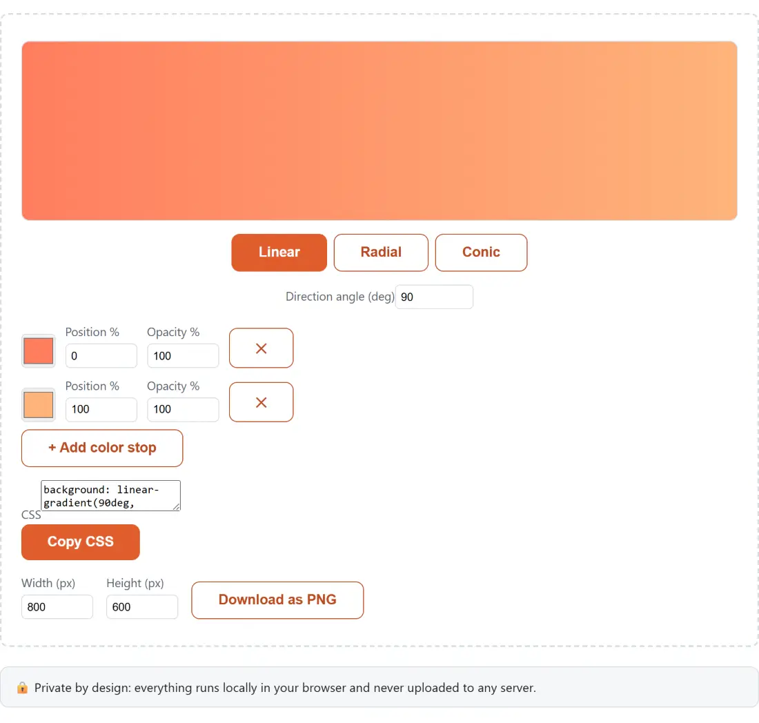
Three buttons sit above the preview, and picking one changes which extra control appears underneath. That is deliberate, because the three gradient functions do not share a vocabulary.
Linear gives you a Direction angle (deg) box. CSS measures that angle from straight up and turns clockwise, so 0deg runs bottom to top, 90deg runs left to right, 180deg runs top to bottom, and 45deg climbs from the bottom-left corner. The value wraps around at 360, so typing 360 puts you straight back at 0.
Radial replaces the angle with a Shape dropdown offering Circle and Ellipse, and nothing else. A radial gradient has no direction, so there is no angle to set. The output is a bare radial-gradient(circle, ...) or radial-gradient(ellipse, ...).
Conic brings the angle box back, this time labeled Start angle (deg), and writes it as conic-gradient(from 90deg, ...). This is the one to reach for when you want a pie-chart wedge, a color wheel, or the swept highlight that shows up on a lot of card borders.
Stops are not re-sorted, they are pushed forward
Each color stop is one row: a swatch, a Position % box, an Opacity % box, and a remove button that stays disabled while only two stops remain. There is no ceiling on how many you add.
The behavior that surprises people is what happens when the numbers go backwards. Positions are made non-decreasing in list order, never re-sorted. Put a black stop at 60% and a white stop at 20% underneath it and the output is linear-gradient(90deg, #000000 60%, #ffffff 60%). The second stop has been dragged forward to meet the first, which is exactly how a browser resolves that case, so the preview stays honest instead of showing a blend that no engine would ever paint.
That same rule is what makes hard color bands easy. Give two adjacent stops the identical position and you get #ff0000 50%, #0000ff 50%: a clean edge instead of a fade, which is the trick behind two-tone section dividers and striped backgrounds.
Opacity per stop, and the moment the output turns into rgba()
The Opacity % box only affects the syntax at the boundary. A stop at 100 is written as a plain hex value. Drop it below 100 and that single stop switches to rgba() with the alpha expressed as a decimal, rounded to two places, so 50% becomes rgba(255, 126, 95, 0.5).
Take a stop all the way to 0 and you get a fade to nothing: linear-gradient(90deg, #1e3a8a 0%, rgba(30, 58, 138, 0) 100%). Note that the generator still names the real color at zero opacity rather than emitting the transparent keyword, which keeps the declaration self-documenting: you can read which color it fades out of without running it. This is the shape you want for a scrim over a photo, or for melting a colored band into the page below it.
Building a hero background from the starting peach gradient
- The page opens on Linear with two stops, and the CSS box already reads
background: linear-gradient(90deg, #ff7e5f 0%, #feb47b 100%);. - Set Direction angle (deg) to the direction you want. For a top-to-bottom hero, that is 180.
- Click each swatch to choose your own colors. The swatch is a native color input, so it takes hex values.
- Adjust Position % on each stop to control where the blend sits, and Opacity % if a stop should fade.
- Click + Add color stop for a third color, then pull its Position % down from 100 so it does not sit on the previous stop.
- Click Copy CSS to take the one-line declaration, or set Width (px) and Height (px) and click Download as PNG for an image file instead.
The PNG export, and the canvas math behind it
Canvas has no function that understands CSS gradient syntax, so the export cannot simply replay the string. It re-derives the geometry instead, and each of the three types needs a different conversion.
A linear gradient becomes two endpoints computed with the standard gradient-line formula, so the painted line covers the box at the angle you set. A circular radial gradient uses the distance from the center to the farthest corner, which is what CSS uses by default. An ellipse is the awkward one: canvas cannot draw an elliptical gradient, so the export renders a unit-radius circular gradient inside a coordinate system scaled unevenly to half the width and half the height, which maps that circle onto an ellipse touching the middle of each edge. That is the one place the PNG and the CSS part company, because CSS sizes an unqualified ellipse to the farthest corner instead, so an exported ellipse reads slightly tighter than the preview. A conic gradient has its start angle shifted by 90 degrees, because canvas counts from three o’clock while CSS counts from twelve.
All of that arithmetic is unit-tested. The canvas drawing calls themselves are only checkable in a real browser, which is the honest limit of the coverage. Dimensions are clamped to between 100 and 4000 pixels per side, the default is 800 by 600, and the button reads a working state while the image is built.
Three gradient features you still have to hand-write
First, vendor prefixes. None are emitted, because no browser still in meaningful use needs them for these three functions.
Second, radial positioning and sizing. The output carries the shape keyword only, so at 30% 70%, closest-side and farthest-side are additions you make yourself after copying.
Third, repeating and stacked gradients. There is no repeating-linear-gradient here, and no way to layer two gradients into one background declaration. Both are easy enough to assemble by hand from what you copy.
For everything around the gradient, the neighbors help. Color Converter turns an HSL or RGB brand value into the hex the swatches expect, WCAG Color Contrast Checker tells you whether your body text survives on top of it, and CSS Minifier and Formatter squeezes the finished stylesheet. CSS Box Shadow Generator is built the same way for a different property, and the rest sit on the generators hub.