Painting areas onto a grid instead of counting quoted tokens
Writing grid-template-areas by hand is a copy-editing job disguised as a layout job. Each row is a quoted string, every string needs exactly one word per column, and a single missing token invalidates the declaration outright. Nothing warns you. The layout just falls back to auto-placement and you go hunting.
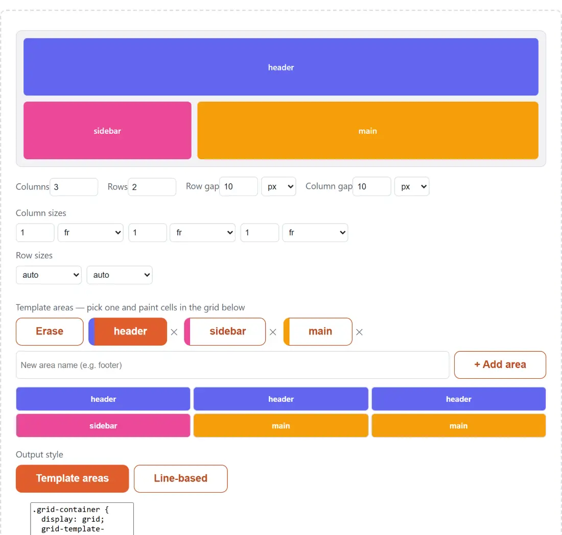
This page replaces that with a matrix you click on. The grid opens with three columns of 1fr, two rows of auto, ten-pixel gaps, and a header, sidebar and main layout already painted so there is something to take apart. Above the matrix sit chips, one per area name plus an Erase chip. Click a chip to make that area active, then press and drag across cells to fill them. Each cell shows either its area name or a dot when it is empty, and the small remove button on a chip deletes the area and clears every cell it occupied.
New areas come from the text box below the chips: type a name and press Enter or click + Add area. The name is sanitized on the way in, because it has to survive as a CSS identifier. Everything outside letters, digits, hyphens and underscores is stripped, so my area becomes myarea, while side-bar passes through untouched. A name starting with a digit or a hyphen cannot be an identifier at all, so the box simply clears itself.
The rectangle rule, and how strictly this builder enforces it
CSS requires every named area to occupy a solid rectangle. An L-shape, or the same name painted in two disconnected blocks, is invalid, and a browser that meets an invalid grid-template-areas value discards the whole declaration rather than salvaging the parts that were fine.
The generator refuses to put you in that position, and it is worth knowing how bluntly. The moment any one area stops being rectangular, a notice names it and the output loses not just that area but the entire grid-template-areas block and every per-area rule alongside it. The HTML pane switches to generic numbered cells at the same time. That is a deliberate all-or-nothing choice: partial output would look plausible and behave wrongly.
Track units, and the number box that vanishes on a keyword
Every column and every row is a track with two controls, a number and a unit. The unit list runs fr, px, %, em, rem, vw, vh, auto, min-content and max-content, and the last three hide the number box, since a keyword track takes no value. A mixed row is written exactly as you would type it, so a 200px sidebar, a flexible middle and a content-sized rail come out as 200px 1fr min-content.
Numbers are cleaned on entry. Negative values become zero, and anything longer than four decimal places is rounded. Gaps use their own, shorter unit list of px, em, rem and %, with row gap and column gap set separately. When both match, the output collapses to the one-value shorthand; when they differ you get the two-value form in row-then-column order, so a roomy 24-pixel row gap with tight 8-pixel columns writes as gap: 24px 8px.
Rebuilding the default header, sidebar and main shell
- Set Columns and Rows at the top. Both accept 1 to 12.
- Give each track a size in the Column sizes and Row sizes strips underneath, choosing a unit per track.
- Set Row gap and Column gap, each with its own number and unit.
- Type an area name, click + Add area, then click its chip and drag across the cells that area should cover. Use Erase to empty cells again.
- Choose an Output style, either Template areas or Line-based.
- Click Copy CSS, then Copy HTML, and paste both into your project.
Left untouched, the starting layout produces this:
.grid-container {
  display: grid;
  grid-template-columns: 1fr 1fr 1fr;
  grid-template-rows: auto auto;
  gap: 10px;
  grid-template-areas:
    "header header header"
    "sidebar main main";
}

.grid-area-header { grid-area: header; }

.grid-area-sidebar { grid-area: sidebar; }

.grid-area-main { grid-area: main; }
Template areas or explicit line numbers, same layout either way
Switching Output style to Line-based describes the identical arrangement with different properties. The grid-template-areas block disappears from the container, and each child gets explicit line placement computed from where you painted it: the header becomes grid-column: 1 / span 3 with grid-row: 1 / span 1, the sidebar takes column 1 of row 2, and main spans columns 2 to 3 of that row.
Neither style is better. Template areas read like a map of the page and are easier to hand to someone else. Line placement is easier to override in a media query, where you often want to move one child without rewriting the container. Since both are derived from the same painted matrix, you can flip between them at any point and compare.
The HTML pane, and the class names it commits you to
The second output box is example markup whose classes line up with the CSS exactly. Whenever you have named areas and they are all rectangular, that means one <div> per distinct area, classed grid-area- plus the area name, with the name as its visible text, in either output style. Without named areas you get numbered <div class="grid-item"> elements instead, one per cell.
Those class names are a small commitment worth making consciously. Rename an area inside the generator and both panes update together, but rename it later in your own stylesheet and you have two places to keep in step. The live preview above uses the very same generated stylesheet, scoped so it cannot leak onto the rest of the page, and it is injected as text rather than as markup, so a painted area name has no route into anything executable.
When the layout is settled, CSS Minifier and Formatter will compress the stylesheet, CSS Gradient Generator handles the backgrounds that go inside these cells, and HTML Table Generator is the better tool when the content is genuinely tabular data rather than page structure. More sit on the generators hub.