One shadow is rarely how light behaves
A single box-shadow is easy to write by hand and easy to spot as fake. Real objects cast more than
one shadow: a dark, tight contact shadow right under the edge where light is fully blocked, and a
wider, much fainter one where the light source is only partly occluded. Every design system that
looks convincingly three-dimensional builds depth out of at least two of those, and often three.
CSS supports this directly. The box-shadow property takes a comma-separated list, and each entry
is drawn as its own shadow, so a stack of two or three declarations is a normal thing to write, not a
hack. The hard part has never been the syntax; it is that four unlabelled lengths and an alpha per
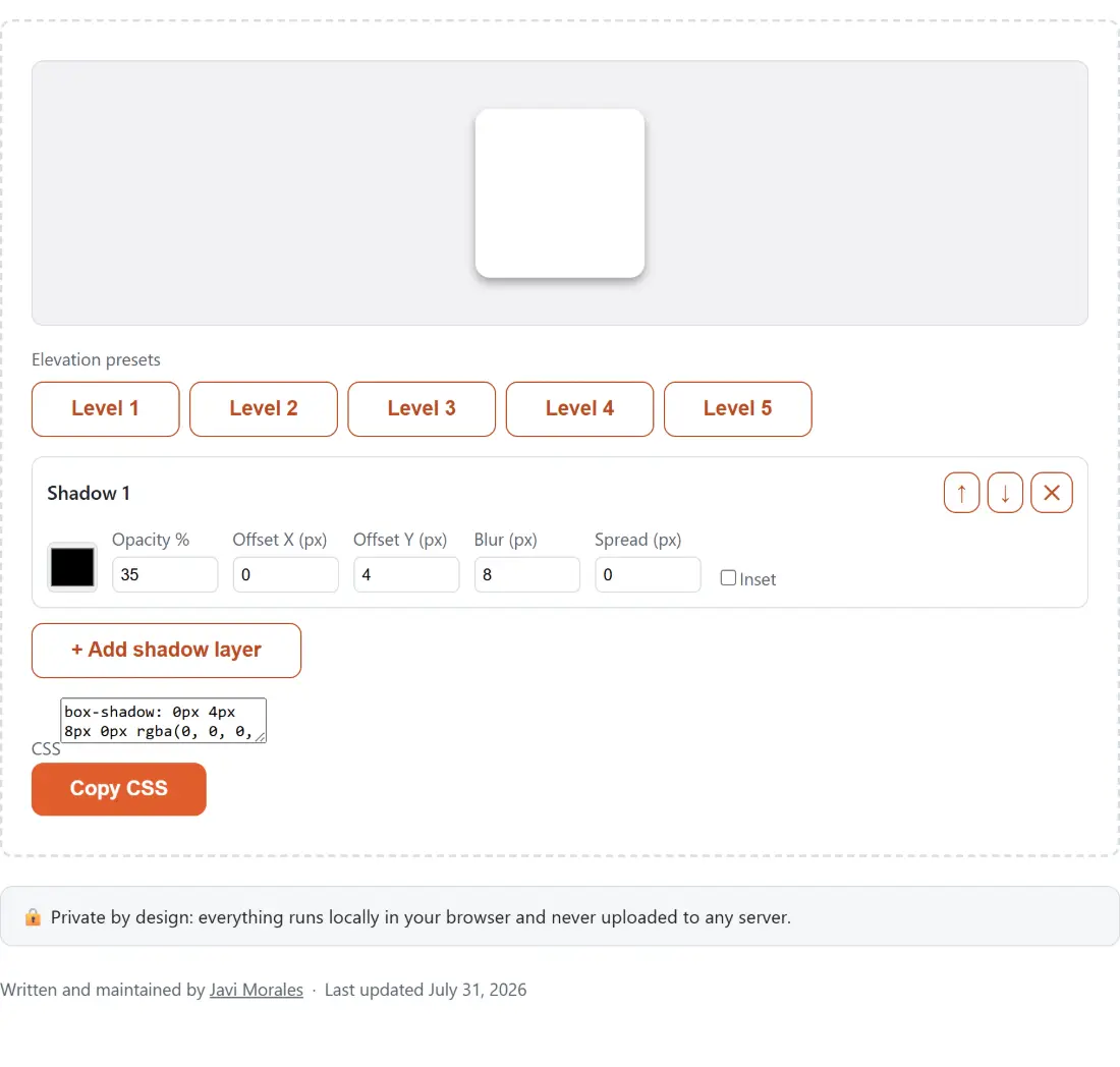
layer is a lot of numbers to hold in your head while guessing in a dev tools panel. This builder
turns each of them into a field with a live preview attached, so you see the result first and read
the CSS afterwards.
The four lengths, in the order CSS reads them
Every layer is written as offset-x, offset-y, blur, spread, colour, optionally prefixed by inset.
- Offset X (px) and Offset Y (px) move the shadow sideways and down. Both accept negative values, so a negative Y throws the shadow upward, which is how you fake light coming from below.
- Blur (px) softens the edge. Zero gives a hard-edged shape, which is what you want for the offset block shadows of a brutalist or retro look.
- Spread (px) grows or shrinks the shadow’s shape before the blur is applied. Negative spread is valid and genuinely useful: it pulls the shadow in tighter than the box itself so a soft blur does not read as a halo. Every elevation preset here uses a negative spread on its tightest layer.
- Inset flips the layer from a shadow cast outward to one drawn inside the element’s edges, which is the pressed-button, inner-border and inset-field look.
The colour swatch and Opacity % are separate fields on purpose. Almost every good shadow is a low-opacity black or a low-opacity dark tint of the surface colour, and separating the two makes it obvious when you have accidentally built a solid black slab.
Stacking, reordering and deleting layers
- Edit the fields on Shadow 1 until the preview looks close, then click + Add shadow layer to append another.
- Set the new layer to something wider and fainter than the first: more blur, a larger Y offset, lower opacity.
- Use the up and down arrow buttons in a layer’s header to move it. The first layer in the list is the one CSS draws on top, so order changes the result whenever layers overlap.
- Remove a layer with the cross button in its header. The last remaining layer cannot be removed, so there is always something to edit.
- Read the finished declaration in the CSS box and press Copy CSS.
Order matters more than people expect once semi-transparent layers overlap, and it matters most when one of the layers is inset. If a stack looks muddier than the sum of its parts, try moving the tightest layer to the top of the list before you start changing numbers.
Five elevation levels borrowed from Material-UI
The preset buttons under Elevation presets read Level 1 to Level 5, rising from a barely-there resting-card shadow to a heavy overlay shadow for dialogs; hovering one shows the longer description of what it suits. Each applies three layers at 20%, 14% and 12% opacity, the umbra, penumbra and ambient split that Material-UI’s own elevation implementation uses. That opacity split stays constant across levels while the shadows themselves get larger and softer, though not by a tidy rule: the two outer layers blur further at every step, while the tight umbra layer’s own offset and spread wander rather than climbing monotonically. Reading the values off a real scale is more instructive than assuming one.
They are modelled on Material-UI’s widely used values rather than an official Google specification. Material Design does not publish one canonical CSS table, and different frameworks render elevation differently, so treat these as a well-worn starting point rather than a citation.
Copy it before you close the tab
Nothing is stored. There is no account, no server call, no local storage and no state in the URL, so a refresh drops you back to the single default layer. Copy the declaration into your stylesheet as soon as it looks right. If the clipboard is unavailable, which happens in some embedded and non-secure contexts, the tool says so and the text in the CSS box can be selected and copied by hand.
From here, three neighbours pick up where this one stops. The CSS Gradient Generator uses the same live-preview-then-copy shape for linear, radial and conic backgrounds. The Color Converter turns a hex value into RGB or HSL with alpha, which is what you need when your design tokens are stored in a different notation from the one this tool emits. And once the stylesheet is finished, the CSS Minifier strips it down for production and shows the before and after size.