Three numbers people think are one number
Ask what your screen resolution is and there are at least three defensible answers, which is why support conversations about it go in circles.
There is what the browser calls the screen size, reported in CSS pixels. There is the viewport, the area inside the browser window where the page is actually drawn. And there is the physical pixel grid of the panel itself, which on a high density display is a multiple of the first.
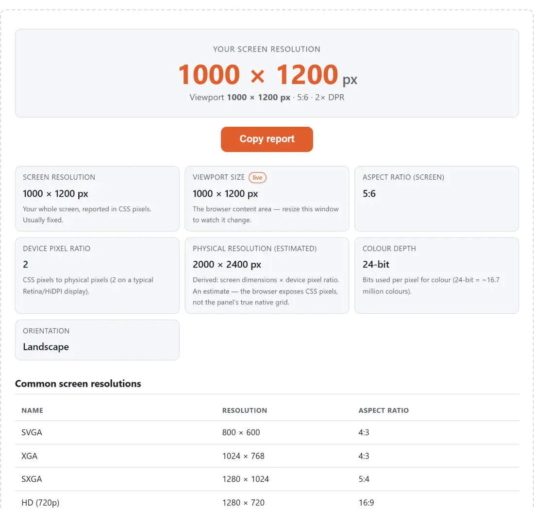
All three are shown here, separately labelled, along with the device pixel ratio that connects the first and the third. Keeping them distinct is the entire point of the page, because conflating them is what causes the confusion in the first place.
Reading your display
- Open the page. The large figure at the top is your screen resolution in CSS pixels.
- Read down the panel: Screen resolution, Viewport size, Aspect ratio (screen), Device pixel ratio, Physical resolution (estimated), Colour depth and Orientation.
- The viewport row is badged live. Resize the window and watch it change. Every other row is re-read at the same moment, so anything that genuinely changed updates with it.
- Compare your screen resolution against the table of common resolutions underneath. If yours is a standard one, it is badged as yours.
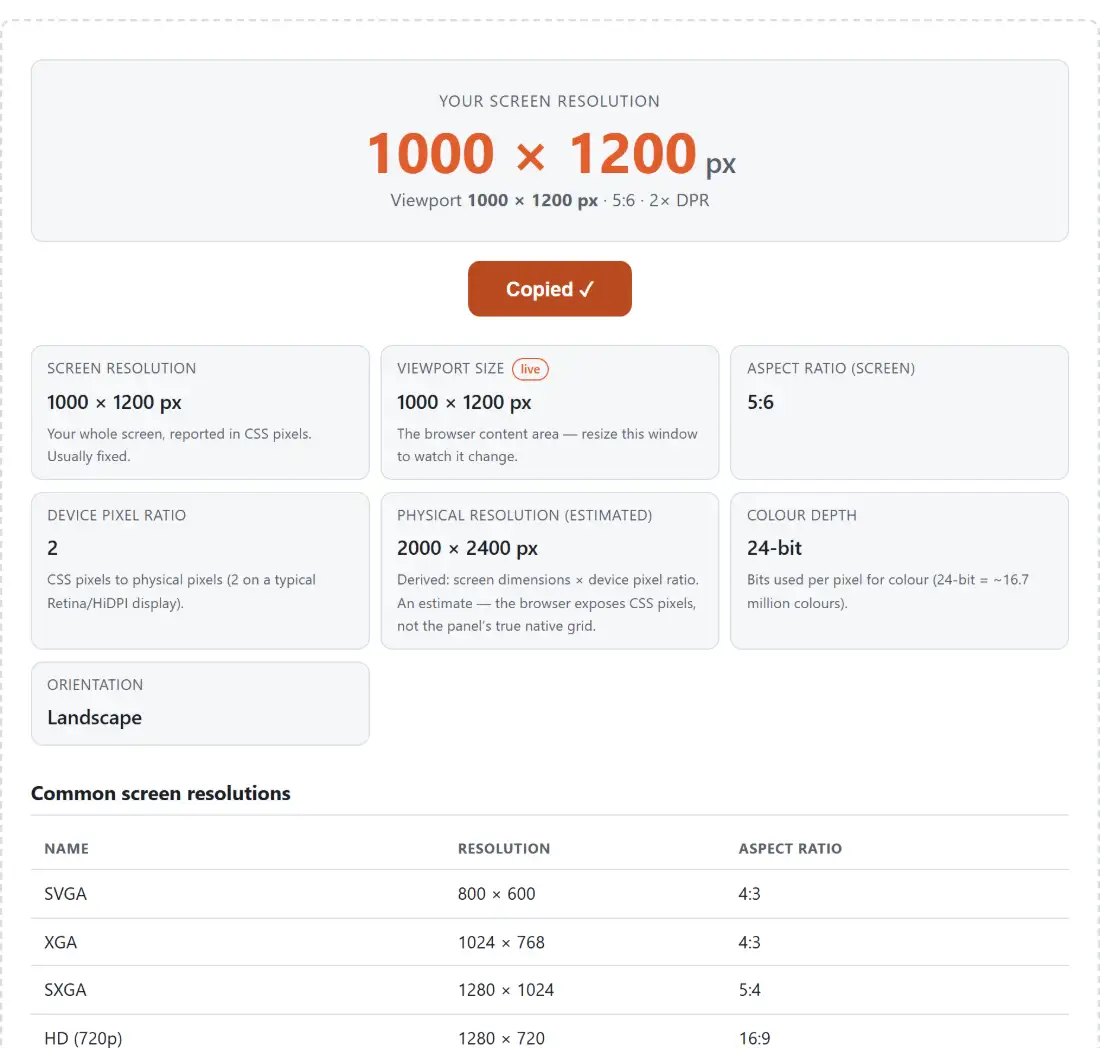
- Use the copy button to put the whole report on your clipboard for a support ticket or a bug report.
If you have more than one monitor, the values describe whichever display the browser window is currently on. Drag the window to the other screen and the panel re-reads as soon as a resize fires, which a change of pixel density usually triggers on its own. If the figures still describe the old monitor, nudge the window’s size to force the read.
Why the box says one thing and the browser says another
A laptop advertised at 2880 by 1800 will commonly report 1440 by 900 here, and the first reaction is usually that something is wrong.
Nothing is wrong. High density displays exist so that text and interface elements stay a comfortable physical size while being drawn from more pixels. The operating system therefore presents a logical coordinate space at roughly half the physical resolution, and the browser reports that space, because that is the space a web page lays out in.
The bridge between them is the device pixel ratio. A value of 2 means two physical pixels per CSS pixel in each direction, so four per CSS pixel in total. Multiply the reported resolution by the ratio and you arrive back at the panel’s real grid, which is what the estimated physical resolution row shows.
It is an estimate rather than a fact because some systems, particularly Windows with a fractional display scale, apply their own scaling on top and the multiplication no longer lands exactly on the hardware figure.
The viewport is the number that matters for building things
If you are debugging a layout, the screen resolution is almost never the value you want. The viewport is.
It excludes the browser’s toolbars, any docked developer tools, and whatever the operating system keeps for itself. It changes when you resize the window, when you open developer tools, and when you zoom, since zooming changes how many CSS pixels fit into the same physical area.
That last one catches people out constantly. A viewport figure quoted without the zoom level it was taken at is not reproducible, and a page that appears to break at a particular width often turns out to have been viewed at 110 percent zoom.
The viewport row is the one to watch while you resize, which makes it easy to find the exact width at which a layout changes. The whole panel is re-read on every resize, but the viewport is usually the only figure whose value actually moves. Zoom is the exception worth knowing about: because zooming fires a resize too, the device pixel ratio and the estimated physical resolution shift with it.
Aspect ratio and the rest of the panel
The aspect ratio is derived rather than looked up. The width and height are reduced by their greatest common divisor, and the result is mapped onto the nearest familiar ratio where one exists, so an unusual resolution still reports as something recognisable instead of a pair of large coprime numbers.
Colour depth reports the bits per pixel the browser believes the display is using. Orientation reports portrait or landscape and is more interesting on a tablet or phone than on a desktop.
For working out matching dimensions from a ratio rather than reading one off, Aspect Ratio Calculator does the arithmetic in both directions.
Related diagnostics
Browser Info is the companion panel for the software side, covering the browser, the platform and the features available to a page.
For timing rather than geometry, Refresh Rate Test measures the frame rate your browser is receiving, which is the other display characteristic worth checking on a new monitor. The rest is on the testers hub.