Re-deriving 4.54:1, the ratio the page opens on
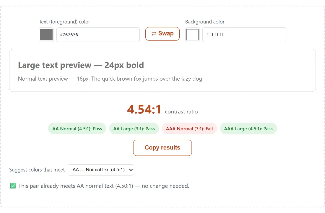
The checker loads with #767676 on #ffffff, and it reports 4.54:1. That number is worth walking through once, because understanding where it comes from explains most of the surprising behaviour further down the page.
Take the foreground first. 76 in hex is 118, and all three channels are the same, so this is a neutral gray. Each channel is divided by 255, giving 0.4627. That is above the 0.03928 cutoff in the spec, so it goes through the gamma decode branch: ((0.4627 + 0.055) / 1.055) ^ 2.4, which is 0.1812. The three results are then weighted 0.2126, 0.7152 and 0.0722 for red, green and blue, and since those coefficients sum to one and the channels are identical, the relative luminance is just 0.1812.
White decodes to a luminance of exactly 1. The ratio formula adds 0.05 to both figures and divides the lighter by the darker, so 1.05 / 0.2312, which the page prints to two decimals as 4.54:1.
Two consequences fall straight out of that formula. Black on white gives 1.05 / 0.05, which is 21.00:1 and is the highest ratio the model can produce. Any color against itself gives 1.00:1. Everything else lives between those.
Four badges, four different questions
The row under the ratio is not four ways of saying the same thing. Each badge names its own threshold and answers independently.
- AA Normal (4.5:1) is the one nearly every compliance requirement means when it says WCAG AA.
- AA Large (3:1) applies only to text that qualifies as large scale.
- AAA Normal (7:1) is the enhanced level, worth targeting for anything people read for minutes at a time.
- AAA Large (4.5:1) shares its number with AA Normal, which is why those two badges always flip together.
The neutral grays make useful reference points. On white, #767676 clears AA Normal at 4.54:1 while #777777 sits at 4.48:1 and fails, so those two indistinguishable grays land on opposite sides of the line. For AAA Normal the boundary is #595959, which the two-decimal display rounds to 7.00:1 while clearing the threshold by a hair; #5a5a5a drops to 6.90:1 and fails.
The 24px and 18.67px line that picks your threshold
Large scale text is defined by the spec as at least 18pt at regular weight or at least 14pt when bold. Converted at the usual 96 dots per inch, that is 24px regular and roughly 18.67px bold. The tool encodes both figures, and the styled preview shows you the difference directly: the top line renders at 24px bold and the line under it at 16px regular.
That gap catches people out. Sixteen-pixel body copy is normal text, not large text, and so are captions, form labels, helper text and almost every legal disclaimer on the internet. If your design leans on 3:1 because a headline passes at it, check that the paragraphs below the headline are not quietly inheriting the assumption.
Checking a pair against a target
- Set the Text (foreground) color, either from the native swatch or by typing into the box beside it. Both fields accept a bare
767676as readily as#767676, and three-digit shorthand likef0aexpands normally. - Set the Background color the same way. Nothing below the two fields renders until both parse, so a mid-edit value briefly hides the results.
- Read the ratio and the four badges. Use ⇄ Swap to exchange the two colors, which is the fastest way to sanity-check a dark-mode inversion of the same pair.
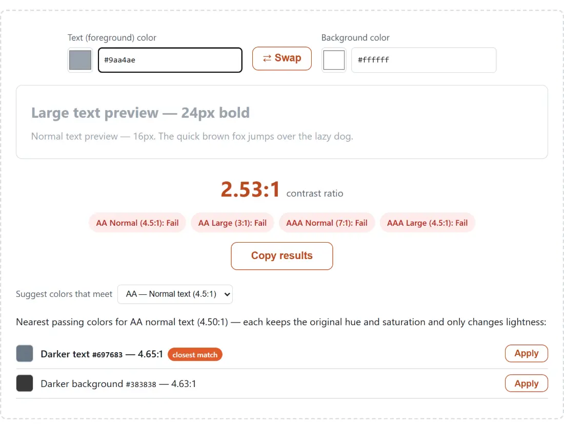
- If it fails, choose an entry in Suggest colors that meet. The four choices are AA normal at 4.5:1, AA large at 3:1, AAA normal at 7:1 and AAA large at 4.5:1, and it starts on AA normal.
- Press Apply on whichever suggested row you want, which loads that color back into the checker so the badges recompute against it. Copy results puts a plain-text summary of both colors, the ratio and all four verdicts on your clipboard for a ticket.
What the suggestion search moves, and how far
The search is deliberately conservative about your design. It never touches hue or saturation, so the suggestion is recognisably the same color family. It only walks lightness, one percentage point at a time, in each of four directions: darker text, lighter text, darker background, lighter background. The first value in each direction that clears the target is returned, and the candidate with the smallest lightness change is flagged as the closest match.
Working through a concrete case makes the cost clear. A friendly mid-blue like #4a9be0 on white scores 2.98:1, so it fails AA normal outright. Asking for AA normal returns two options rather than four. The nearest is darker text at #2178c1, reaching 4.64:1, which required dropping lightness from about 58 to about 44. The alternative is darkening the background all the way to #2e2e2e for 4.56:1, an 82-point move that is plainly not a tweak. Both lighter directions come back empty, because the background is already white with nowhere left to go and lightening the text only walks it closer to that background.
So the reassuring line that accessibility only costs you a few percent of lightness is sometimes true and sometimes not, and this tool will tell you which case you are in rather than pretending.
Hex only, opaque only, WCAG 2.x only
Three limits are worth stating plainly. There is no alpha channel here, so semi-transparent text over a photograph or a gradient cannot be checked: composite it first and test the resulting flat color. There is no gradient or image sampling either, though you can pull a flat color out of a screenshot with the image color picker and paste it in, or lift a stop out of something built in the CSS gradient generator.
And this is WCAG 2.x arithmetic only. APCA, the perceptual contrast model drafted for WCAG 3, uses a completely different calculation and would give different answers; it is left out rather than blended in, because 2.x is what conformance is measured against today.
For the neighbouring pieces of the same job: convert an RGB or HSL brand value to hex with the color converter, build a set to test with the palette generator, and check the same pair through protanopia and deuteranopia in the color blindness simulator. The rest of the set is in developer tools.