Four frames, and the exact pixel size each one exports
Every frame has fixed geometry, so the output size is predictable before you click anything. The phone renders its bezel at 1380 by 2820 pixels, the tablet at 1900 by 2500, and both the laptop and the browser window at 2400 by 1600. The Padding around the device (% of frame width) value is then applied as a margin on all four sides, computed from the frame’s own pixel width and added to the canvas. At the default 8% that turns the phone into a 1600 by 3040 export and the laptop into 2784 by 1984.
The padding field is clamped to the range 0 to 20 and rounded to a whole percent, so typing 7.6 gives you 8 and typing 50 gives you 20. Setting it to 0 exports the bare frame with the bezel touching the canvas edge, which is what you want if you are going to place the device on your own background later.
Center-cropping is the step that decides whether the result looks right
Your screenshot never gets stretched or letterboxed. It is center-cropped to the exact aspect ratio of the target screen area and then drawn to fill it edge to edge, the same “cover” behavior a CSS background image uses. That is the right default, and it is also the one thing worth thinking about before you drop the file in.
The screen areas are genuinely different shapes. The phone’s is 412 by 892, a tall 0.46 ratio. The tablet’s is 688 by 888. The laptop’s is 1152 by 676 and the browser’s is 1200 by 744, both roughly widescreen. Feeding a 1920 by 1080 desktop capture into the laptop frame trims 40 pixels from each side, which nobody will ever notice. Feeding the same image into the phone frame keeps a 499 pixel wide sliver out of 1920 and throws away everything else, which everyone will.
If the source shape is wrong, re-shoot or re-frame it rather than pre-cropping. Both this tool and Crop Images crop from the centre, so running a 1920 by 1080 capture through the Portrait (9:16) preset first hands the phone frame exactly the same central 499 pixel strip it would have taken anyway. Portrait (9:16) is still the closest of that tool’s four ratios to the phone screen’s 0.46, and it takes a whole batch at once, so it is the right stop when you want a 9:16 asset in its own right.
Framing a whole batch in one pass
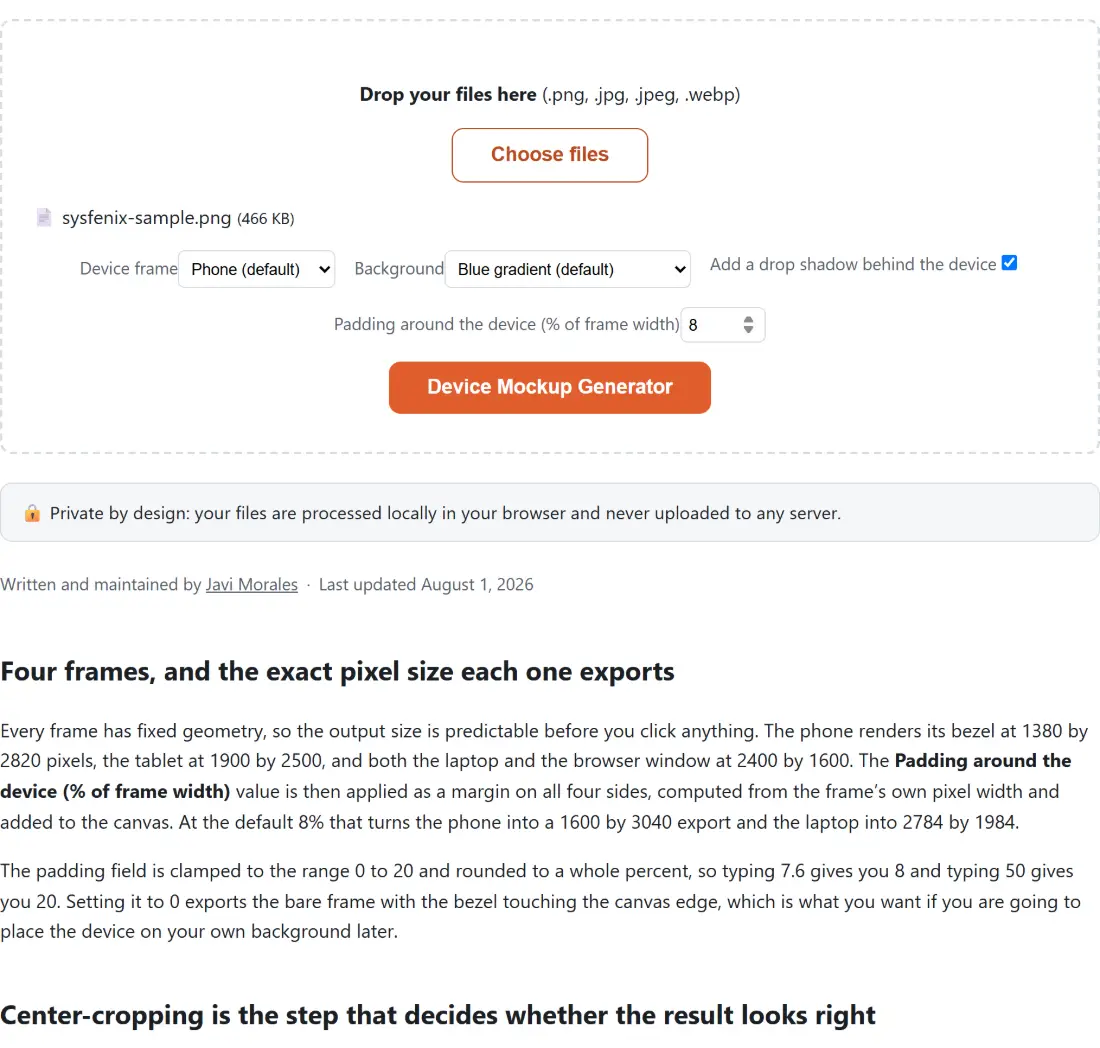
- Drop your screenshots into the box above, or use Choose files. The dropzone takes PNG, JPG, JPEG and WebP, and a file already sitting in the list is not added a second time.
- Pick a Device frame: Phone (the default), Tablet, Laptop or Browser window.
- Choose a Background, from Blue gradient, Sunset gradient, Solid light, Solid dark or Transparent (no background).
- Leave Add a drop shadow behind the device ticked or clear it, and set the padding percentage.
- Click Device Mockup Generator. Every screenshot in the batch gets the same frame, background, shadow and padding, and each download is named after its source file with the device appended, so
dashboard.jpgcomes back asdashboard-laptop-mockup.png.
Note the extension change on that last line. Output is always PNG, because the transparent background option needs a real alpha channel and JPEG has none. That also means the mockup is usually a larger file than the screenshot you fed in, and the shell’s size line will say so.
How the composite is actually assembled
The draw order is worth knowing, because it explains the limits. First the background fills the canvas, or is skipped entirely for the transparent option. Then, if the shadow is on, a blurred and downward-offset silhouette of the frame is stamped at the frame’s own corner radius, so it is completely hidden behind the bezel afterwards and only its soft edges survive. Then your cropped screenshot is drawn into the screen rectangle, clipped to the screen’s rounded corners. Finally the bezel SVG goes on top, with a transparent hole cut out over the screen area by an even-odd fill rule, so the frame’s own pixels cover the screenshot’s edges cleanly.
Everything happens on one canvas, using OffscreenCanvas where the browser has it and a regular canvas element where it does not. There is no try/catch around individual files in the batch loop, so if one image fails to decode the whole run stops and nothing is downloadable. If that happens, pull the suspect file out and run the rest.
What the frames are, and what they are not
These are stylized bezels, not device portraits. The phone is a rounded rectangle in near-black with a pill-shaped notch. The tablet is a slightly lighter body with a home-button ring in the taller bottom bezel. The laptop adds a hinge seam and a webcam dot, and its lower deck is part of the same bezel shape rather than a separate element. The browser is a plain square-cornered rectangle with a toolbar band across the top carrying three colored traffic-light dots and an address-bar pill, and its screen runs full-bleed to the left, right and bottom edges.
Nothing here is a licensed render of a real product, and that is intentional. If your App Store submission needs exact current hardware, use the vendor’s own asset. If you need “a phone”, “a laptop”, “a browser”, this is faster than any of them.
Where the workflow continues
A mockup is rarely the last step. If the point of the image is to explain a feature, arrows and callouts go on afterwards, and Annotate Screenshot takes a PNG directly and hands one back. If a platform demands an exact pixel width, Resize Images accepts the PNG output and processes a whole set at once. For a copyright mark across a set of client deliverables, Add Watermark to Photos covers the same batch of files.
Code snippets are a different problem with a different answer: framing a terminal screenshot in a browser window looks odd, and Code to Image Screenshot Maker renders the code itself with syntax highlighting instead. The rest of the image tools cover the conversion and compression steps around all of this.