A CSS pixel is not a millimetre
Ask a browser for a box 96 pixels wide and you have not asked for an inch. You have asked for 96 CSS pixels, a unit whose real size on glass depends on the panel’s pixel density, on the operating system’s display scaling, and on whatever zoom level the page happens to be sitting at. The CSS specification does anchor its reference pixel to one ninety-sixth of an inch, and that constant is in this tool’s source, but it is there as the naive assumption to be corrected, not as a measurement. It survives contact with a real 141 PPI laptop panel for about half a second.
Device pixel ratio does not rescue it either. That number relates CSS pixels to device pixels; it says nothing about millimetres. Two 24 inch monitors, one 1080p and one 4K, disagree about how many device pixels fit in an inch and agree about nothing useful in between.
So this page draws no ruler at all until you have calibrated one. That is a deliberate refusal: a tool whose entire value is being true to scale cannot open with a guessed scale and a confident set of numbers printed under it.
Two calibration paths, and where each one goes wrong
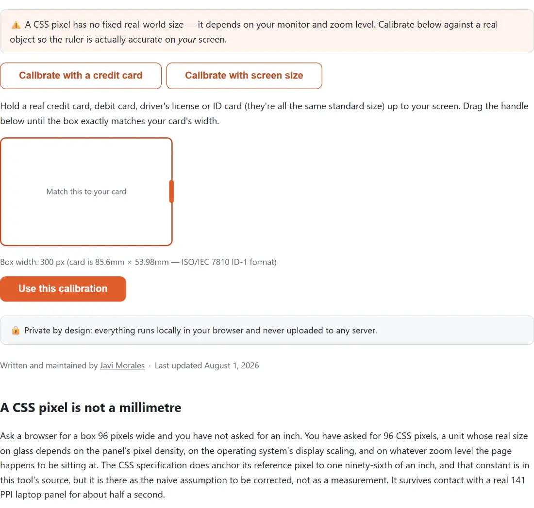
The first path uses a card. Bank cards, debit cards, most driving licences and most ID cards are built to the ISO/IEC 7810 ID-1 format, 85.60 mm by 53.98 mm, everywhere in the world. The page draws a box in exactly that proportion, starting 300 CSS pixels wide and refusing to go below 60, with a grab strip down its right edge. Hold your own card against the screen, drag until the two edges line up, and press Use this calibration. The arithmetic behind the button is a single division: the box width in CSS pixels over 85.6.
The second path asks for three numbers instead: Diagonal size (inches), Horizontal resolution (px) and Vertical resolution (px), pre-filled with 15.6, 1920 and 1080. It takes the diagonal in pixels, takes the diagonal in millimetres, and divides. With those defaults it previews an estimated physical screen width of 34.5 cm, or 13.6 in, and calibrates to 5.560 px/mm, which the ruler then reports as 141.2 px per inch. Press the button with an impossible value in one of the three fields and it refuses, printing a plain line of text under them rather than calibrating to nonsense.
There is one trap worth spelling out. The figure to type is the resolution your browser is laying pages out in, not the number printed on the box the monitor came in. Our screen resolution checker shows both halves of that question, the resolution the browser reports and your device pixel ratio. Where those two disagree, feeding the panel’s native pixel count into the diagonal method scales every tick mark by exactly that ratio, which is why the card is the safer choice on a HiDPI laptop. For the record, on that 15.6 inch 1080p panel the card box has to be dragged out to roughly 476 px before it matches a real card.
What the 30 cm track actually draws
In metric mode the widget places a tick at every whole millimetre across 300 mm, 301 of them, with a labelled major tick each centimetre and a taller unlabelled one at each half centimetre. Switching between mm and cm changes only the labels, never the positions: cm counts 0 to 30, mm counts 0, 10, 20 and onward to 300. Inch mode redraws at eighth-inch spacing over twelve inches, 97 ticks, labelled at each whole inch.
The track itself is 90 px tall with the ticks hanging from its baseline, and it scrolls sideways when the calibrated ruler outgrows your window, which it usually does. At that 5.560 px/mm calibration, 300 mm of ruler is about 1668 CSS pixels wide.
Dragging out a measurement, and one quirk to know
Press anywhere on the track and drag. A shaded band follows the pointer and a line underneath reads out the span in whichever unit the toolbar is set to, millimetres and centimetres to one decimal place, inches to three.
One behaviour to be aware of, because it looks like a bug the first time it happens: the widget never releases the anchor point when you lift the pointer. Move the cursor back across the ruler afterwards and the band keeps stretching from where you originally pressed. Nothing is broken, and the reading is still correct for wherever the pointer currently is; just press down again at the new starting point when you want a fresh span.
Getting a true reading in four moves
- Choose Calibrate with a credit card or Calibrate with screen size from the two buttons at the top of the calibration panel.
- For the card, drag the handle on the right edge of the box until it matches a real card held against the screen. For the screen method, fill in the diagonal in inches plus the horizontal and vertical resolution, and check the estimated physical width it previews back at you.
- Press Use this calibration. The ruler replaces the calibration panel and the pixels per millimetre figure is saved for next time.
- Pick mm, cm or in in the toolbar, hold the object against the screen, and either read the ticks or drag along the track for a decimal readout. Recalibrate starts the whole thing over.
Where a screen ruler stops being good enough
Calibration error propagates. On the panel above, where a real card matches a box about 476 pixels wide, ending up five pixels out is roughly one percent wrong everywhere on the scale, which nobody will notice checking whether a phone fits an envelope and which matters a great deal if you are cutting material to length. Thickness works against you as well: anything you hold against the display sits a few millimetres in front of the pixels, so reading at an angle introduces parallax that no software can remove.
Treat it as a good sanity check, not an instrument. When the answer needs to be in a different unit afterwards, the unit converter handles length in both directions. When you want squares of a known size on paper rather than on glass, the graph paper generator builds the grid in millimetres and hands you a PDF. And when what you are actually measuring is a foot, the shoe size converter takes that centimetre figure straight into US, UK and EU sizes. There are more display and input widgets like this one on the testers hub.